Though modal dialogs are not a new concept in UI design, the number of homegrown Lightbox clones ( source) appearing on the Web since major JavaScript libraries like Prototype and jQuery hit the scene has been staggering. Unfortunately, many of the clones developed leave some key usability considerations unaddressed, and struggle with common problems in accessibility.
Some key usability features that should be considered during creation of a Web-based modal dialog include (1) manage focus and allow tab navigation (2) disable elements outside the modal dialog (3) give users an out and (4) provide graceful error recovery.
Manage focus and allow tab navigation
Guide the user experience by managing focusable page elements using JavaScript.
- Tabbing should allow the user to navigate back to the browser’s location bar and other tabbable toolbars.
- When the modal dialog is shown, the user should not be able to tab to document content outside the dialog content area.
- When the dialog is hidden, focus should be restored to the initial element used to activate the modal dialog, the original tab ordering should be restored and the user should no longer be able to tab to content inside the modal dialog.
Disable elements outside the dialog
Guide user interaction with page elements outside of the modal dialog and keep focus in the lightbox window.
- Display a translucent overlay above the page while the dialog is shown, giving the perception of modality while maintaining frame of reference to existing page content.
- Prevent interaction with elements outside the modal dialog using script to do the following:
- Save and then temporarily set a new tab order for all applicable elements;
- Save and then temporarily set the disabled flag on all applicable elements; and,
- Save and then temporarily update applicable hyperlink click handlers to return false.
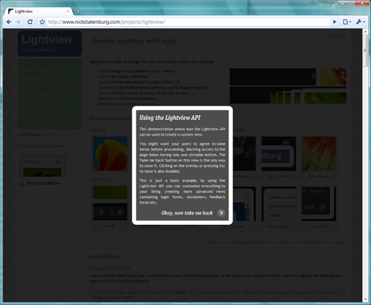
Give users an easy way out
Give users the ability to exit unwanted modal dialogs without thinking much about it.
- Use a graphical x link the user can click to initiate the hide method. In addition, consider using the graphic as a background image for a text-based link (e.g. Close) to help improve comprehensibility slightly for both sighted and non-sighted users while maintaining application scalability with a single link implementation.
- While the dialog is displayed, listen for the Esc key. If it is pressed, exit the modal dialog and restore the previous display state.
- If the Lightbox was activated by the user, make the close link the next focusable element in the tab order.
Provide graceful error recovery
Script display methods (e.g. hide/show) should listen for script errors and, upon error, close the modal dialog and restore previous settings–including any previously focused element. Utilize the try/catch block to make it happen, but beware that suppressed errors increases debugging complexity.
Related articles
See also Roger Johansson’s Lightboxes and keyboard accessibility for additional considerations in improving Lightbox usability, with a focus on keyboard accessibility.